People don’t give a lot of thought to forms—they can seem like a technicality and therefore unimportant to core business goals. But that’s a mistake. A form is a request for information, and like any request, your chances of getting an affirmative response are much higher if you ask nicely. They are especially critical in insurance because the insurance industry requires so many forms. So, let’s see how you turn the inevitable forms into an opportunity.
The need for better UI in the insurance industry
One of the major challenges in the insurance industry is the user interface. Insurance providers have been slow to adapt digital tools, leaving customers with clunky paper and PDF forms that are difficult to use and aren’t aesthetically pleasing. In an age where most other types of commerce are completed with sleek, streamlined online interfaces that utilize the principles of outstanding design spearheaded by pioneers like Apple, that stands out to users, and not for good. According to a PwC survey, 41% of customers say that say they are likely or more likely to switch providers due to a lack of digital capabilities and identify lack of digital capabilities, including good user interface, as the top challenge while interacting with insurers.
[.figure]41%[.figure]
[.emph]of customers say that say they are likely or more likely to switch providers due to a lack of digital capabilities[.emph]
What to look for in an effective and user-friendly interface
What are the principles of user interface and good design? For items like forms, they include but are not limited to:
Text size and spacing: Use a font that’s easy to read at a standard viewing distance, and leave enough space between lines that the text is easy to read
Contrast: Create a contrast between the background and text color.
Format to device: Your users may be viewing a form on a variety of devices. Make sure that the content fits all of their screens.
Touch controls: Make it easy to navigate between fields and select menu items with touch controls, and not only with a mouse.
Alignment and organization: Put controls and buttons next to the elements they modify and make it easy for the user to understand how elements relate.
Why good design is so important in the insurance industry
Forms are often a customer’s first interaction with an insurance provider and therefore responsible for their first impression. If the first form that a customer encounters is a PDF that needs to be downloaded, printed, and signed, that first impression will not be positive, especially for customers who are young digital natives.
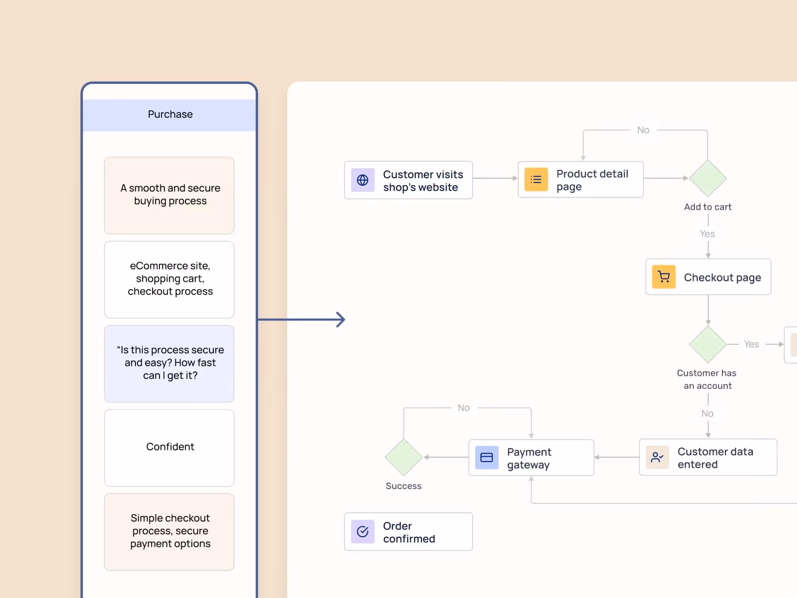
Web forms vs digital journeys: what is the difference?
Building individual forms that utilize the principles of good UI is not enough. That’s because forms are only one type of interaction that the customer has with their insurance provider. A digital journey, on the other hand, includes all the different stages, touchpoints, and branching points in which a customer interacts with an insurance brand or organization, from initial awareness through sales, service, and retention.
When web forms are part of the larger digital journey, they can help insurance providers improve their customer experience, improve business outcomes, and better understand their customers.
Benefits of improved UI for your forms
Higher completion rates
When customers get frustrated, they simply opt-out. Forms with good UI have significantly higher completion rates than those that don’t, and higher completion rates mean more sales and more conversions.
Fewer errors
Forms with good UI include inline validation and can’t be submitted with errors. That means that customers don’t experience the frustration of submitting a form only to have it rejected. Insurance providers don’t have to waste costly resources reviewing forms and tracking customers down and getting them to correct errors.
Better customer experience
Good UI leads contributes to a better overall customer experience. That’s because customers understand what they need to do, and aren’t dependent on service agents who may or may not be available at a given time.
Examples of improved UI in action
UI can revolutionize the insurance industry. Let’s look at examples of insurance providers who have seen the results of great UI.
Meridio
Meridio makes it easy for employers to offer comprehensive coverage to their employees. Using EasySend, they were able to transform 66 complex PDFs into a single dynamic digital experience. Agents can simply enter the state where their customer is located and they are seamlessly led through a process that meets that state’s regulations and the customer’s policy.
Lemonade
Lemonade has been a trailblazer for UI and UX in the insurance industry. They use a contract that starts off with a “squeezed” version, which is a quick overview of the contract for people who don’t have the time to read all of the details. Their forms use simple language, large font, and a structure that make them easy to understand and don’t scare off potential customers. Although they are new to the industry, they were able to gain a significant portion of their market by offering improved UI and UX.
Tips for Creating Better Forms

Make it simple
More isn’t better when it comes to forms, in fact, the opposite is often true. Customers’ time is limited and they often lose patience and give up if a form has too many fields. It’s always a good idea to minimize the number of fields on a form and include only what is absolutely crucial for the specific transaction, nothing more.
Use autofill
If the objective is having fewer fields to fill out, eliminating fields is only one part of the equation. That’s because in the insurance industry, many fields are crucial for activities like risk assessment and claims processing. However, autofill can help ease the burden on the customer.
If the customer has conducted prior business with the provider, the form should automatically be populated with information that the customer filled out in earlier activity. At a minimum, they should utilize the autofill feature offered by browsers like Google Chrome and Firefox that pull from past information entered on a visitor’s device. Even if it’s only basic information like the customers' name and email, it will go a long way toward simplifying the process.
Start easy
The more fields a customer completes on a given form, the more they are committed to the process and the less likely they are to abandon it. Therefore, it’s a good idea to start off with easy fields like biographical information, getting them to commit before presenting more complicated questions.
Real-time validation
There is nothing more frustrating for a customer than to fill out a form only to find out days or weeks later that the form has been rejected due to an error. Real-time validation prevents that from happening. If customers enter incorrect information, like an invalid email or address, they should get an error message real time, as well as helpful suggestions on how to correct the error. Since they won’t be able to move on to the next step before they correct the error, there is no chance that they will experience the frustration of filling out an entire form only to have it returned.
Mobile-friendly design
It’s more likely than not that your customer is filling a given form on his or her phone. The form should use a mobile-friendly form design that ensures that all fields fit the screen it’s being viewed on so that the form can be completed on the go.
Structure
If your customers have to scroll down to find the end of a form, they may decide that it’s too much of a hassle and not even start it. That’s why it’s a good idea to split long forms into several subsections, and include a progress bar that shows the customer how much they have left.
Times are changing, and so are forms
A beautiful and seamless intake form is more than a form—it’s an invitation for the customer to join a journey with their insurance provider. By building forms with the right design and integrating them into a larger digital journey, forms have the potential to revolutionize the insurance industry and meet the needs of a changing market.
FAQ
Forget forms. Create digital customer journeys.